Welcome to my first weekly Creative Practices post. For the first week deciding on three images was a bit of a challenge. I’m excited about this assignment and have often thought about forcing myself to do exactly this- take a camera with me everywhere I go and find aesthetically pleasing in moments in my life and document them. The added dimension of assessing what it is that attracts me to the images I choose through out the week is a great way to activate, engage and challenge the visual part of my brain. For the first week I debated about just taking three photos and seeing what came out or deciding on a theme and finding photos that fit. I ended up just taking my camera and from looking at the images that I took over the course of a few days seeing if I could decipher a common element that attracted me to each image. Here are the images:
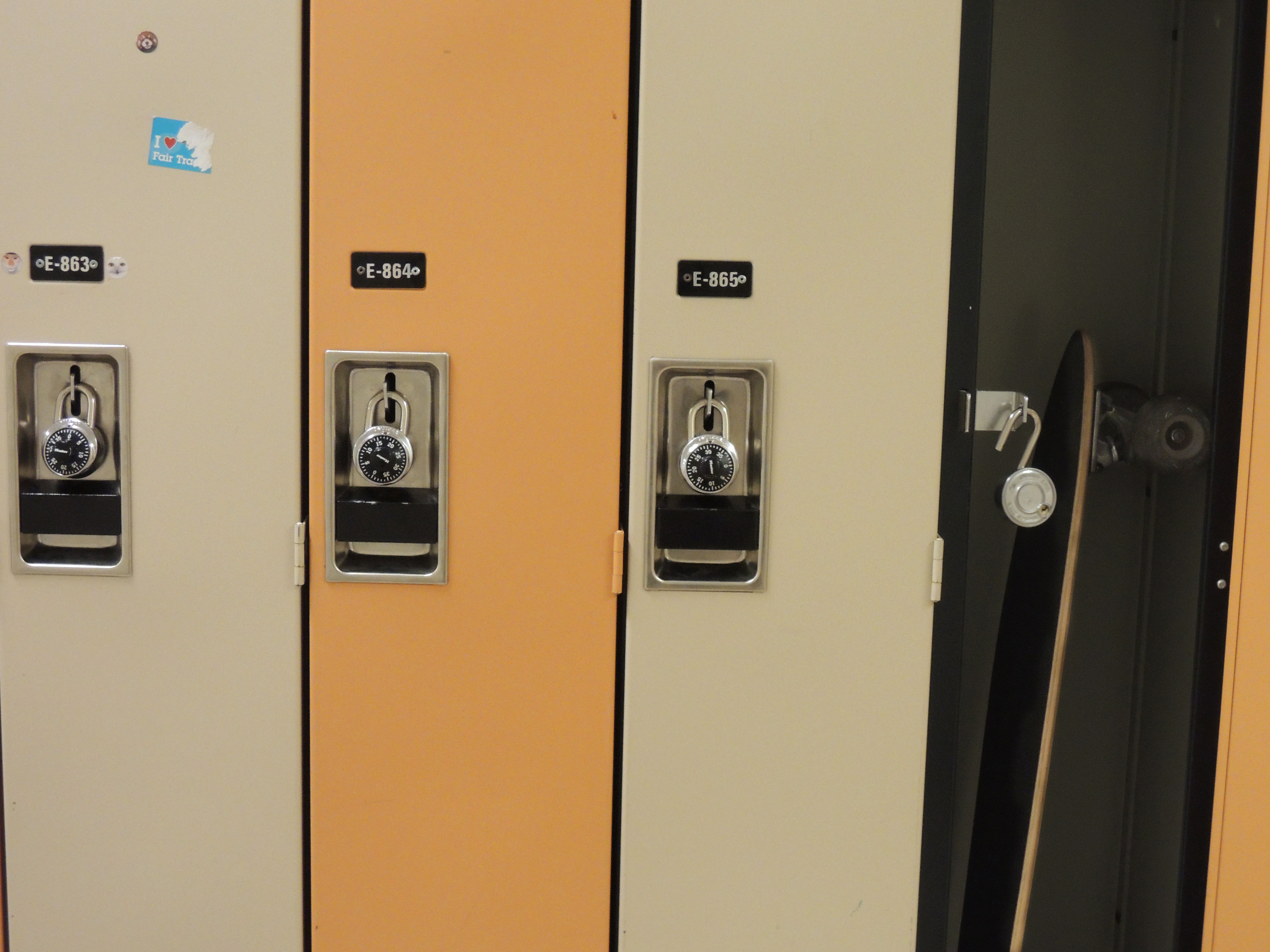
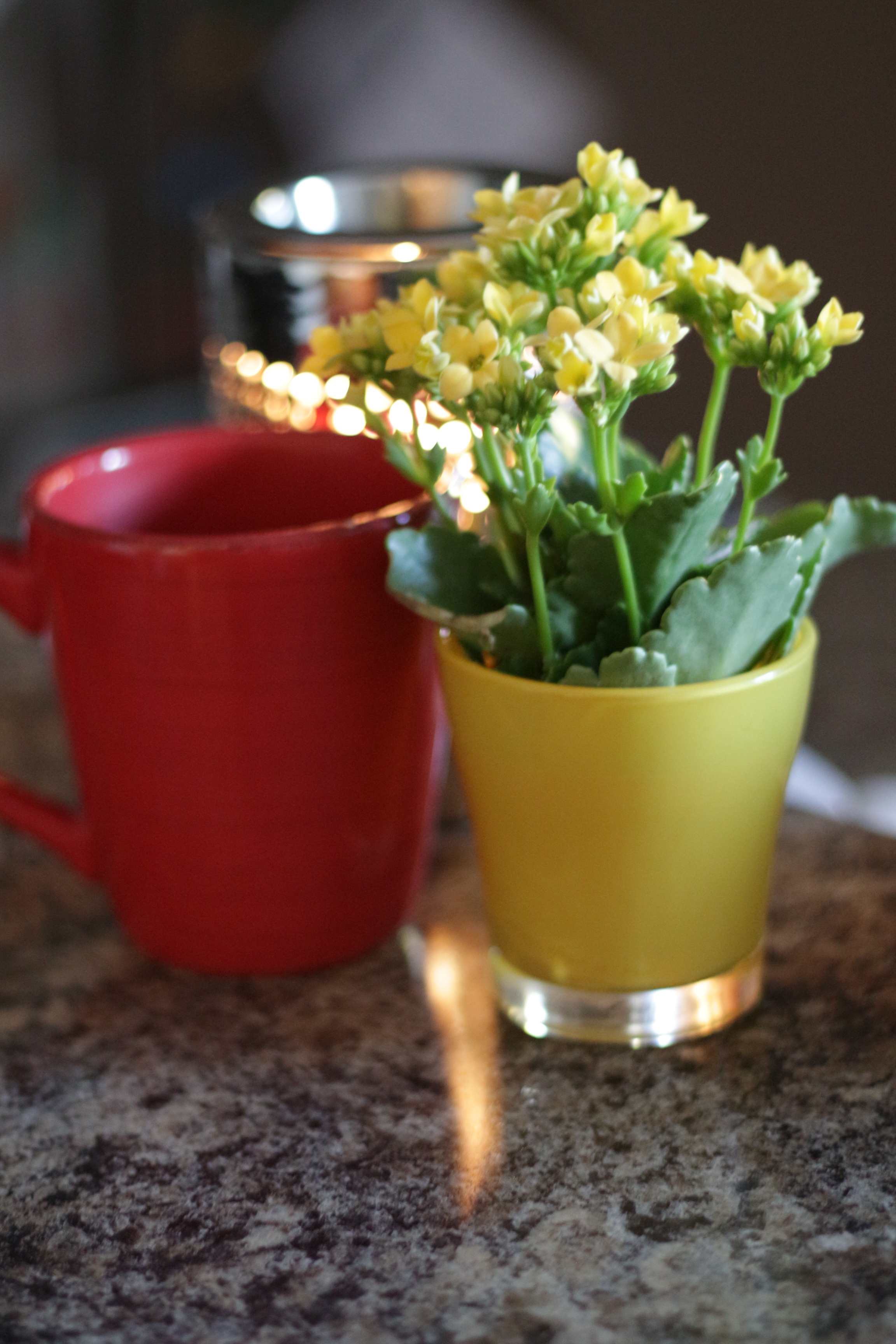
When I take some time and look at these three photos that are all very different that the through line must be contrast. Contrast is represented here in a few different ways. In the hallway photo there are several examples of contrast. First the cold colours of the tiles and metal railing against the warmer colours of the turning trees outside are a visual colour contrast. Second there is the contrast of the organic and inorganic materials the hard lines and textures of the concrete and metal, the straight lines in the window frames in contrast to the curves and natural lines in the plants both inside and outside. The contrast in the locker photo comes from the repetition of closed lockers broken by the open locker. The closed lockers are also very bright and the open locker is very dark so there is a juxtaposition that happens based on the contrasting brightness. Also the open locker breaks the repeating colour pattern. Finally the flowers and the coffee mug are contrasted in the use of contrasting primary colours. The red and the yellow contrast each other and the cool blue light of the background. This contrast focuses the eye on the warm and bright central subjects of the image. Again this picture also has a bit of organic and inorganic contrast.
The more I look at the images though the more I see that there is a lot of repetition of forms. There are straight lines and repeated shapes in the hallway, there are repeated lines and patterns in the locker, there are repeated shapes in the coffee mug and the flower pot, in the flowers and the light. I wonder if the break of repetition may be what causes my eye to notice that there is repetition there in the first place or if I actually noticed the repetition first and the contrast second. I think as I progress in my Creative Practice observations it will be important to really be aware of what comes to me initially and what the secondary or tertiary effects are. I think that the idea that there are several reasons we find things aesthetically engaging is key to knowing why certain images attract our attention and hold it longer. I would be interested in exploring this relationship between the depth of an aesthetic experience and the fleeting moments of our current digital/media based culture…
Wow! Who knew three pictures of daily life could be so engaging.

One thought on “Weekly Creative Practices Post”